

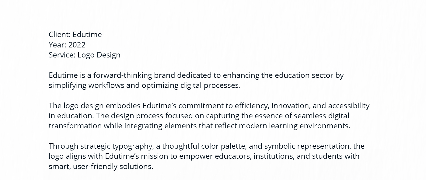
Edutime is a dynamic educational platform designed to bridge the gap between students and knowledge. The branding aims to look approachable, modern, and motivating. This visual identity project encompasses logo design, UI/UX elements for web, and corporate stationery, creating a cohesive look for a forward-thinking educational brand.


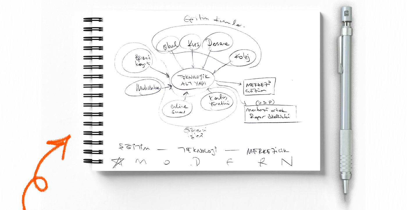
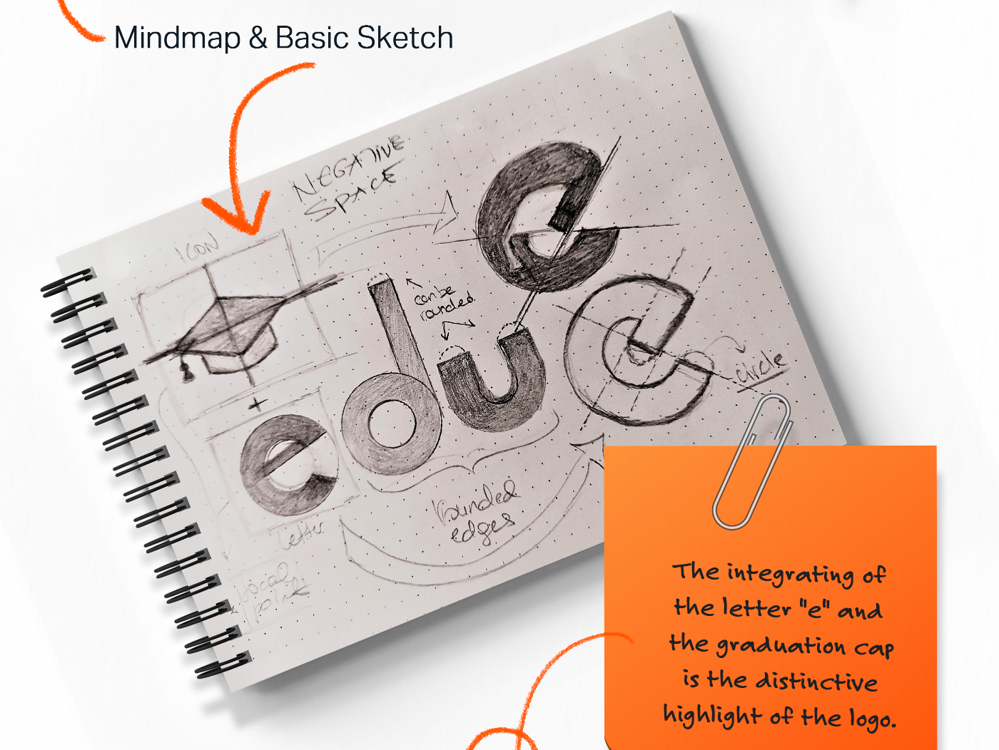
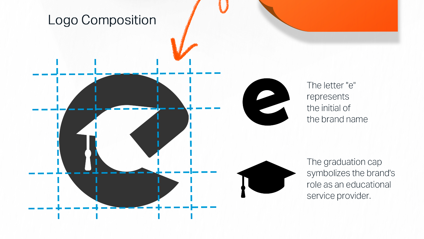
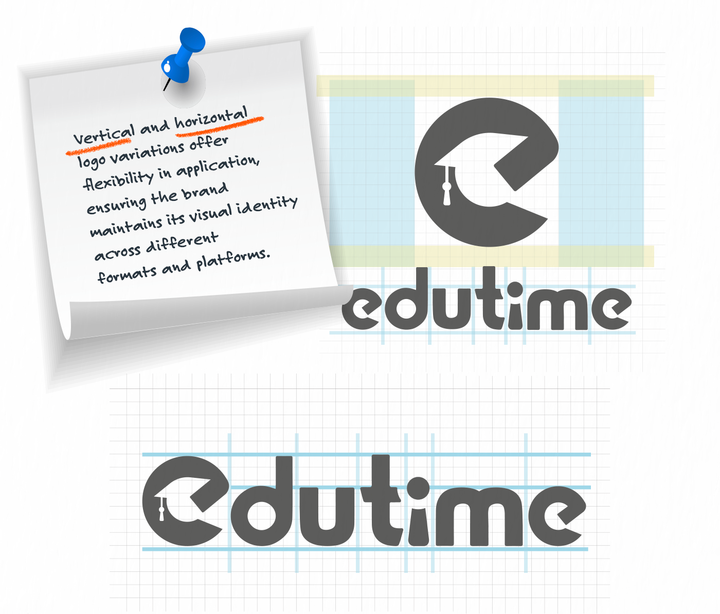
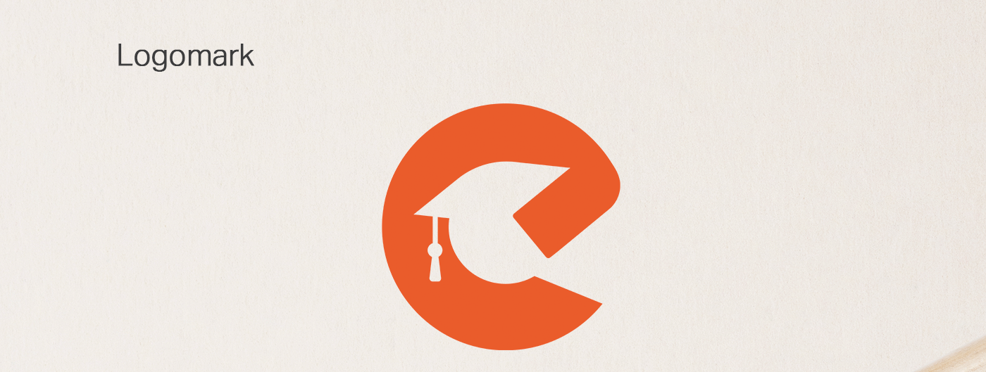
The logomark is a clever fusion of typography and symbolism.
Using a geometric grid, the letter "e" is transformed to resemble a graduation cap (mortarboard).
The negative space within the icon suggests an arrow pointing forward, symbolizing progress, future growth, and the momentum of learning. The rounded sans-serif typography complements the icon, making the brand feel friendly and accessible to students of all ages.
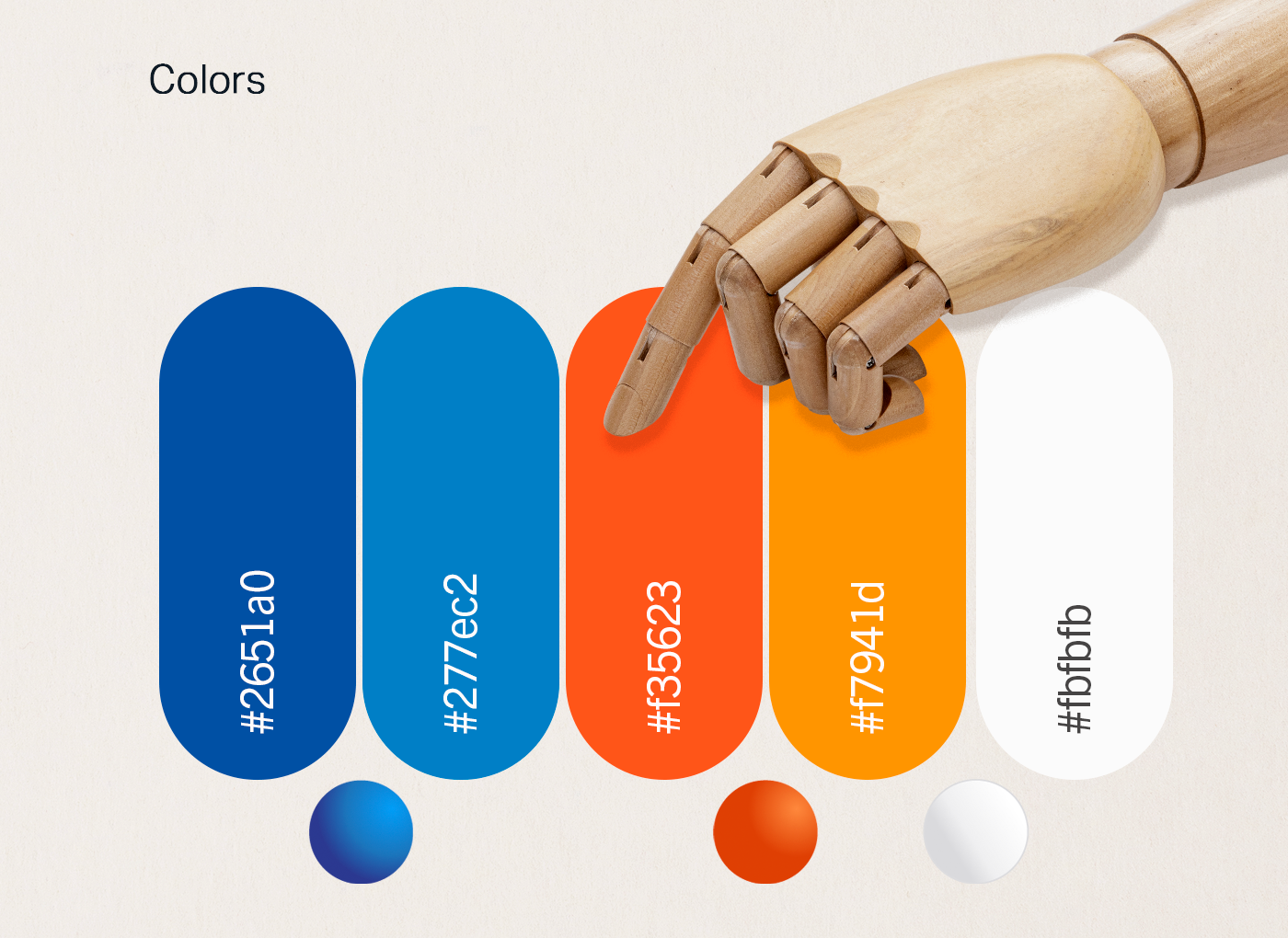
Color Strategy: Energy Meets Trust The visual language relies on two primary colors tailored for the education sector:
Vibrant Orange: Represents energy, creativity, enthusiasm, and youth. It grabs attention and stimulates mental activity.
Academic Blue: Represents intelligence, trust, stability, and technology.
Together, these colors create a balance between the excitement of learning and the reliability of the institution.
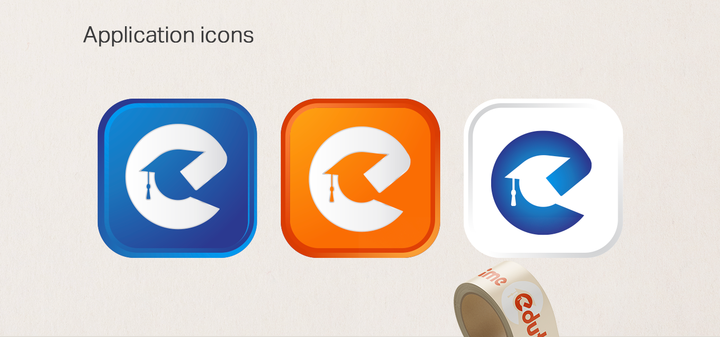
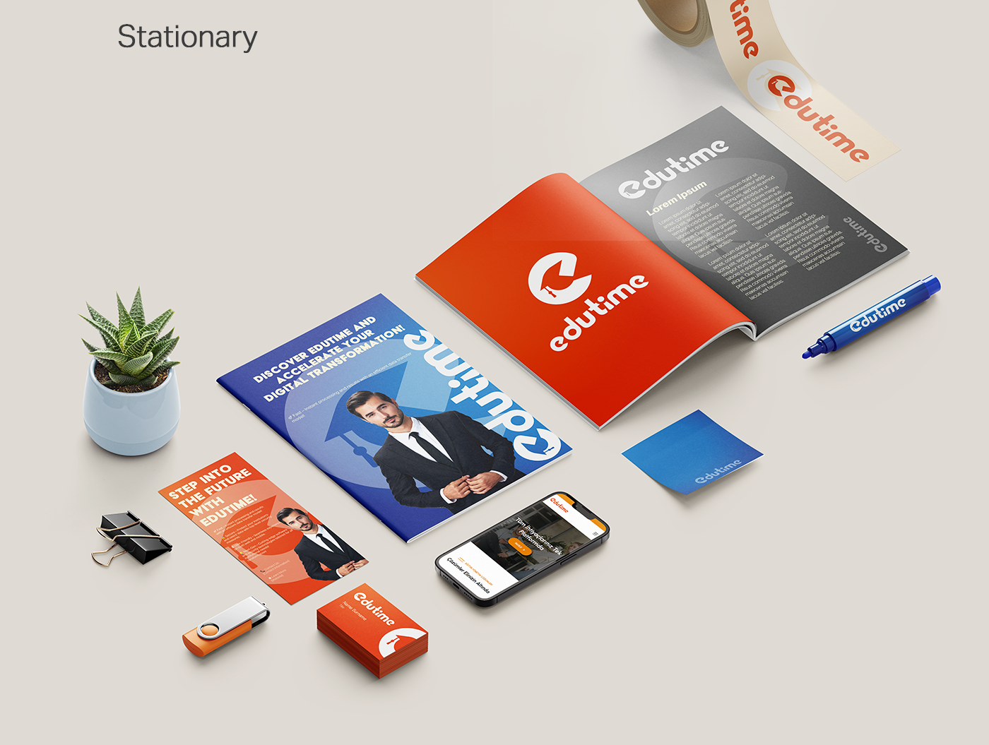
Brand Application & UI Design: The identity system is versatile, scaling perfectly from small mobile app icons to large-format print brochures. The web interface design utilizes the brand's curved shapes and vibrant palette to create an engaging user experience (UX), ensuring that the "Edutime" platform feels intuitive and welcoming for users navigating online courses.
Want to see the logo in action?
Go to Edutime - Next Generation Educational Institution Management System
Go to Edutime - Next Generation Educational Institution Management System