Project Overview
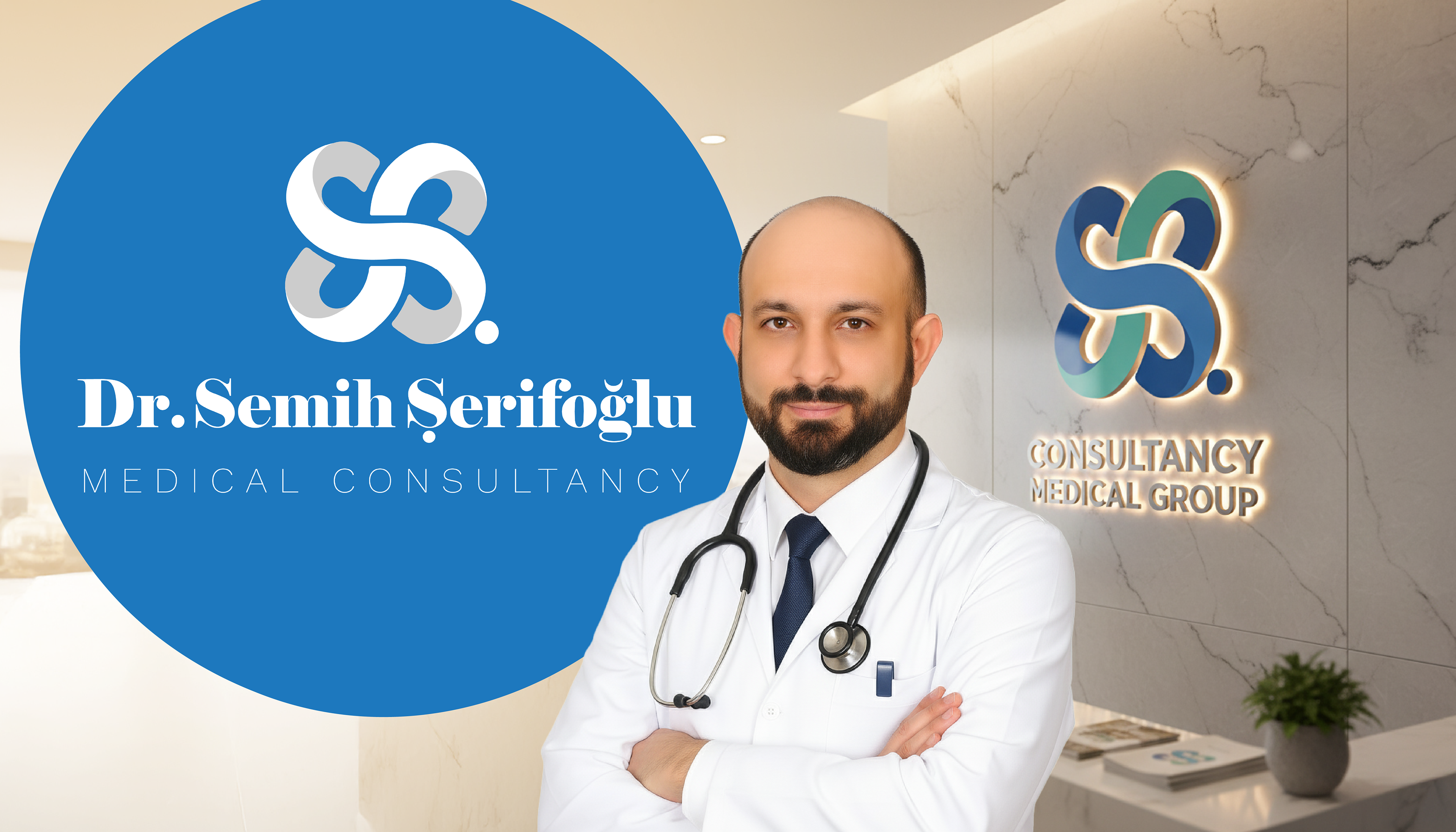
In the healthcare sector, trust is the most valuable currency. This branding project establishes a professional visual identity for Dr. Semih Şerifoğlu, a medical consultant. The goal was to move away from generic medical clichés and create a symbol that represents expertise, continuity of care, and modern medicine.
The Logo Concept
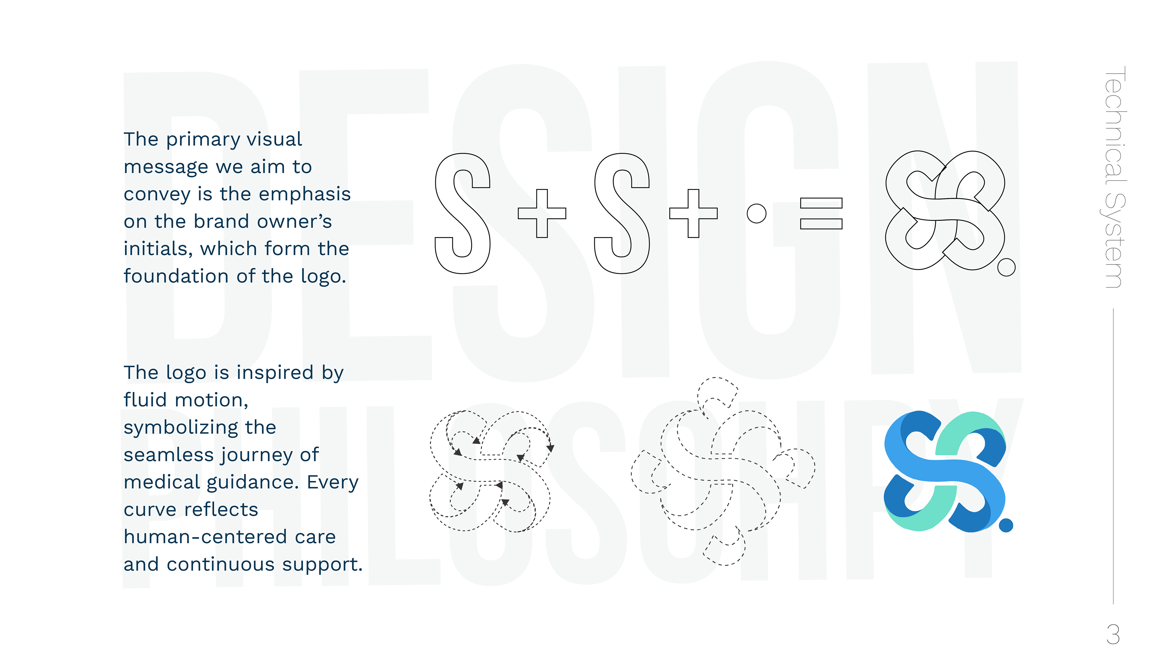
The logomark is a result of a geometric equation: Initials + Symbolism.
The Double 'S': Representing the doctor's initials (Semih Şerifoğlu).
The Medical Cross: Hidden within the negative space and the intersection of the shapes.
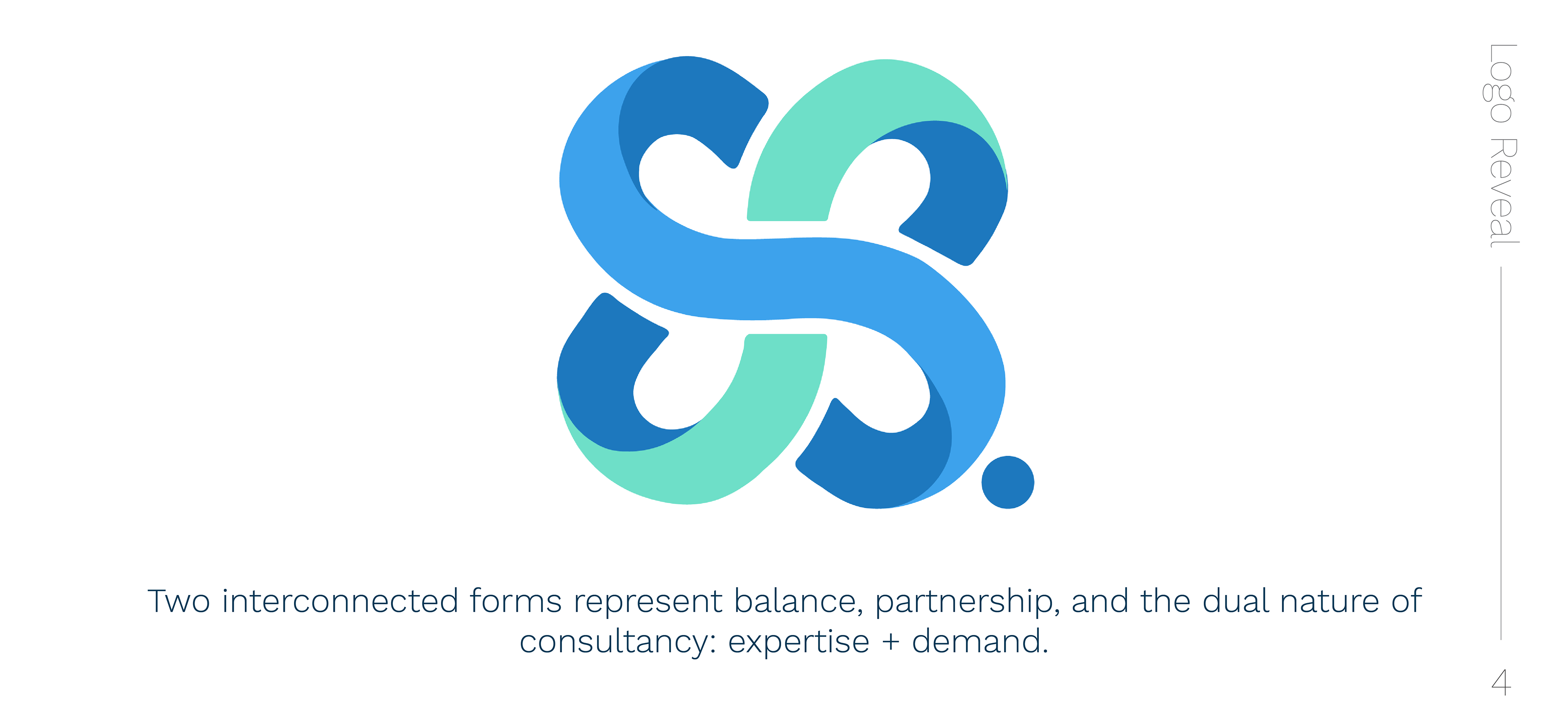
The Infinite Loop: The fluid, interlaced structure resembles a DNA helix or an infinity knot, symbolizing continuous health
and holistic life cycles.
The result is a soft, rounded icon that feels approachable and safe, rather than sharp and clinical.
Color Strategy
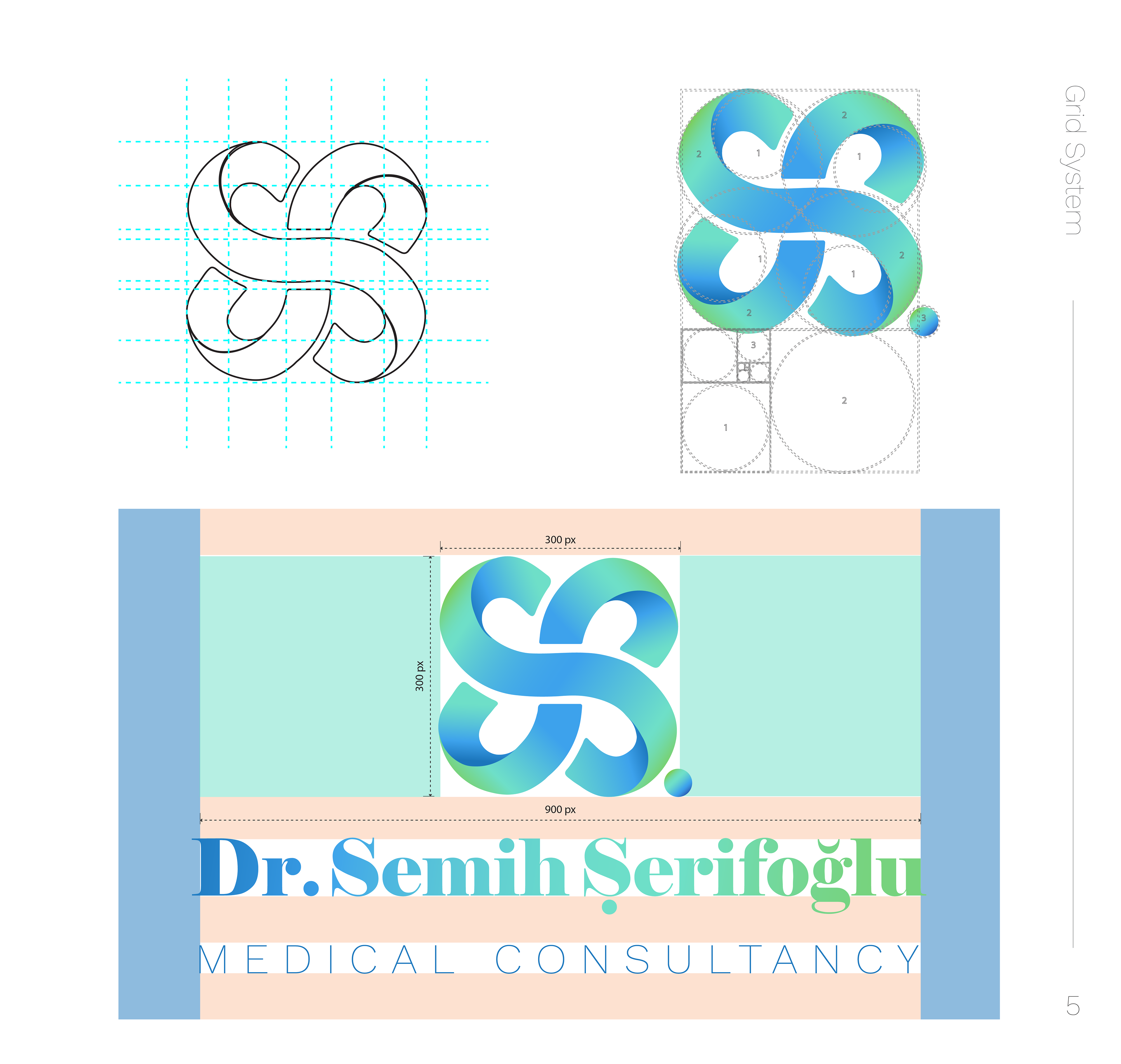
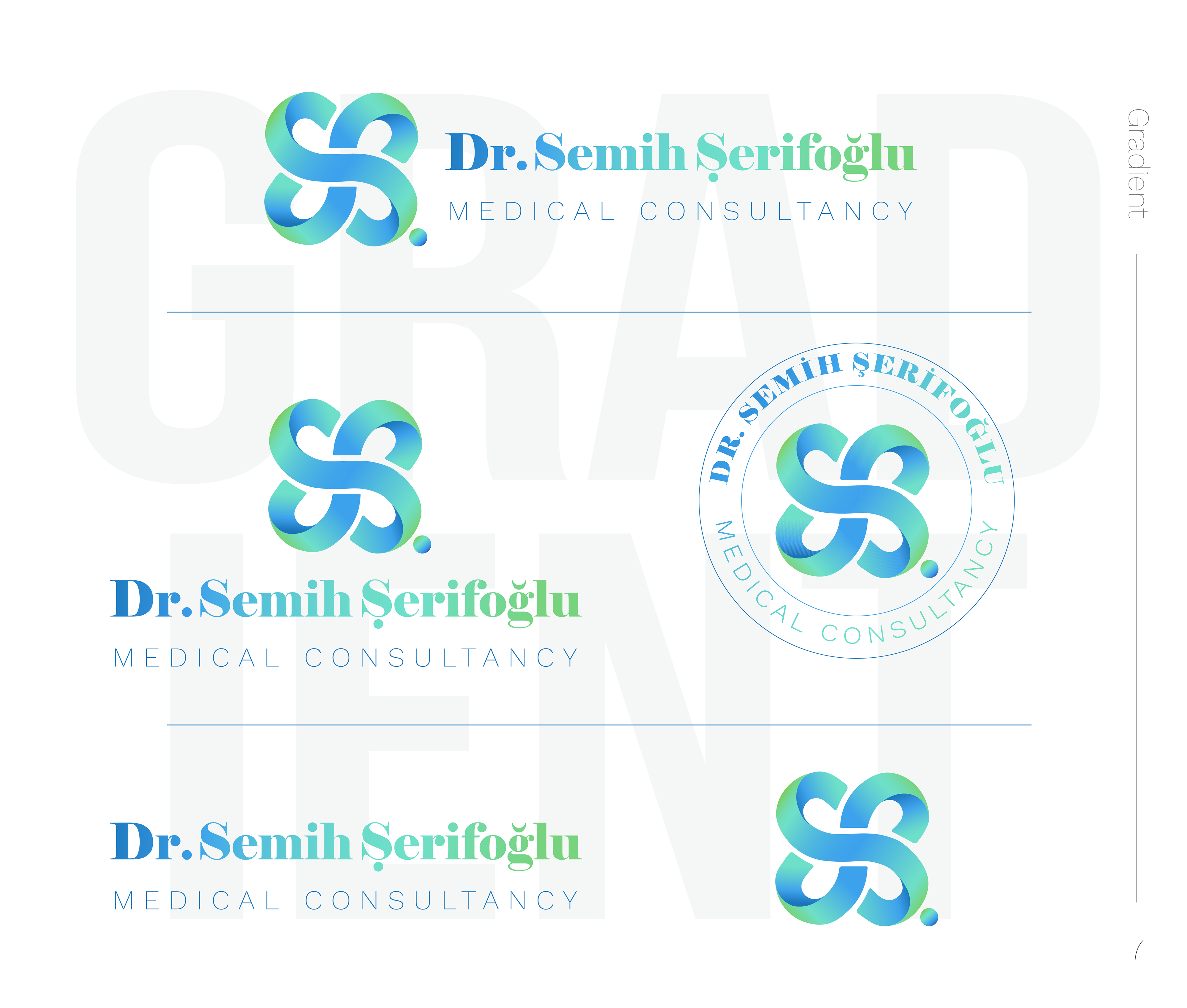
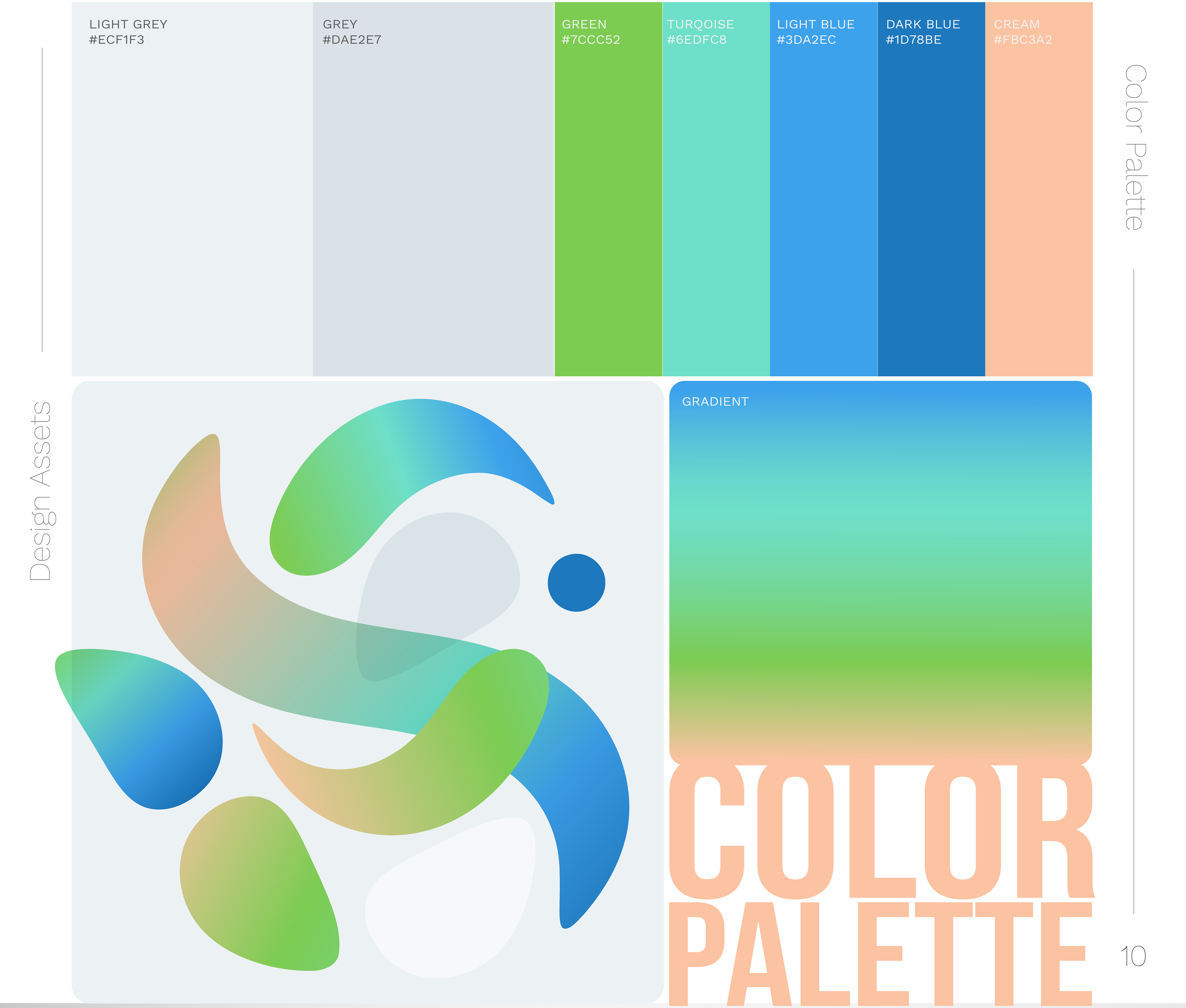
The Palette: We utilized a calming gradient transitioning from Clinical Blue (representing science, trust, and cleanliness) to Vitality Green (representing nature, life, and healing). This gradient adds a modern "tech-health" feel to the brand.
Typography Strategy
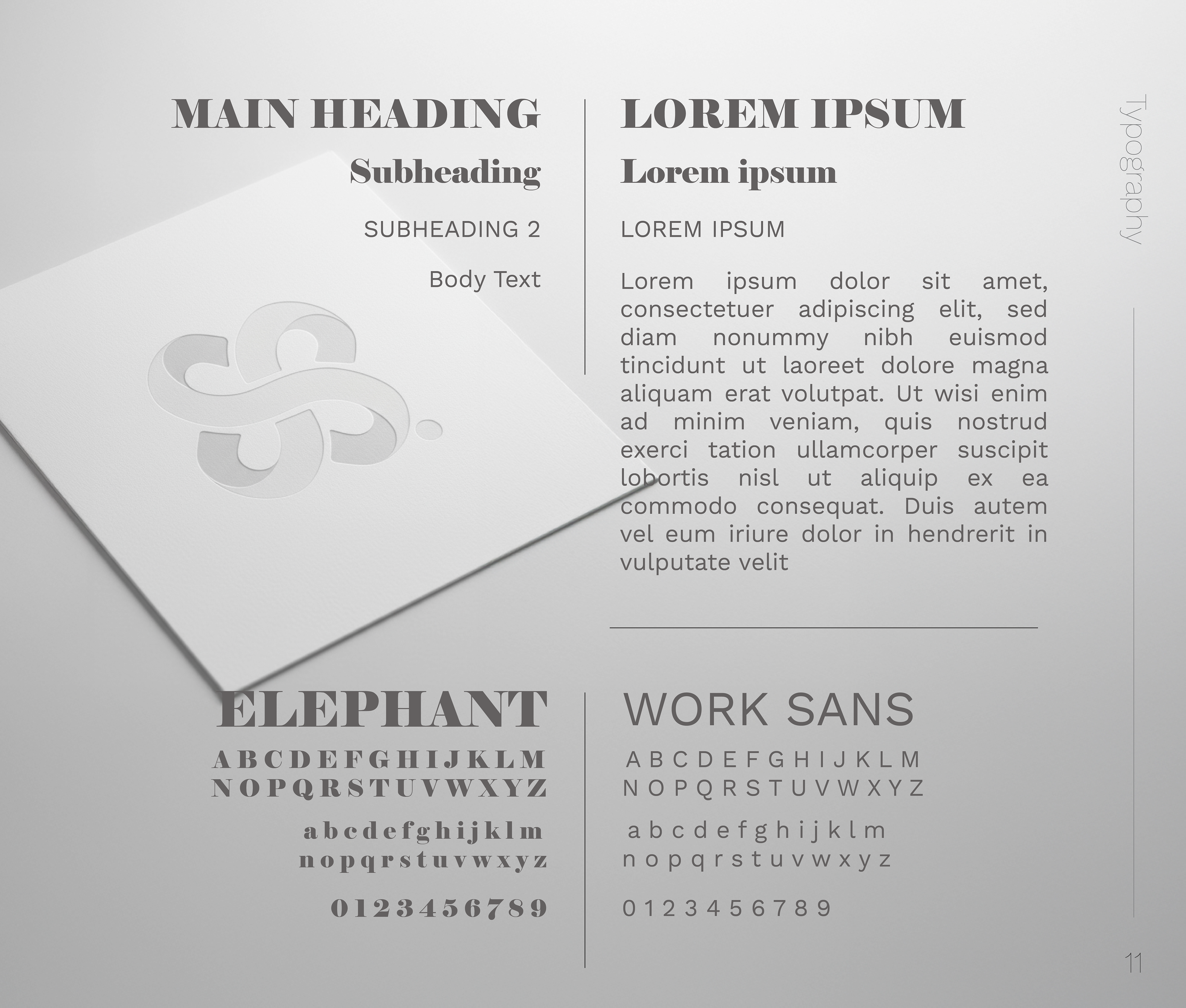
The Typography: A strategic pairing of "Elephant" (a strong serif font that conveys authority and academic wisdom) with "Work Sans" (a clean modern sans-serif for clarity and readability).
A Holistic Brand Experience
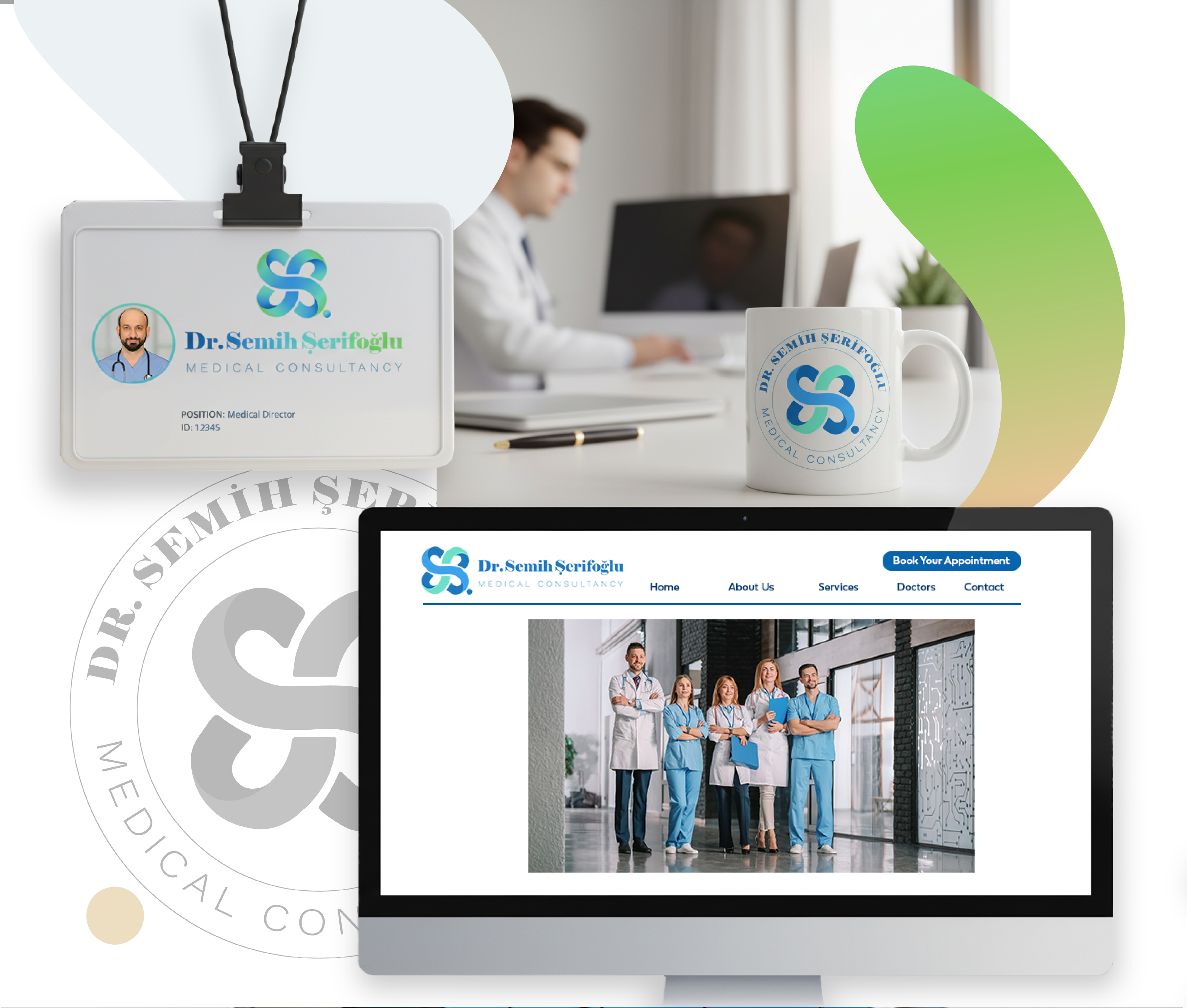
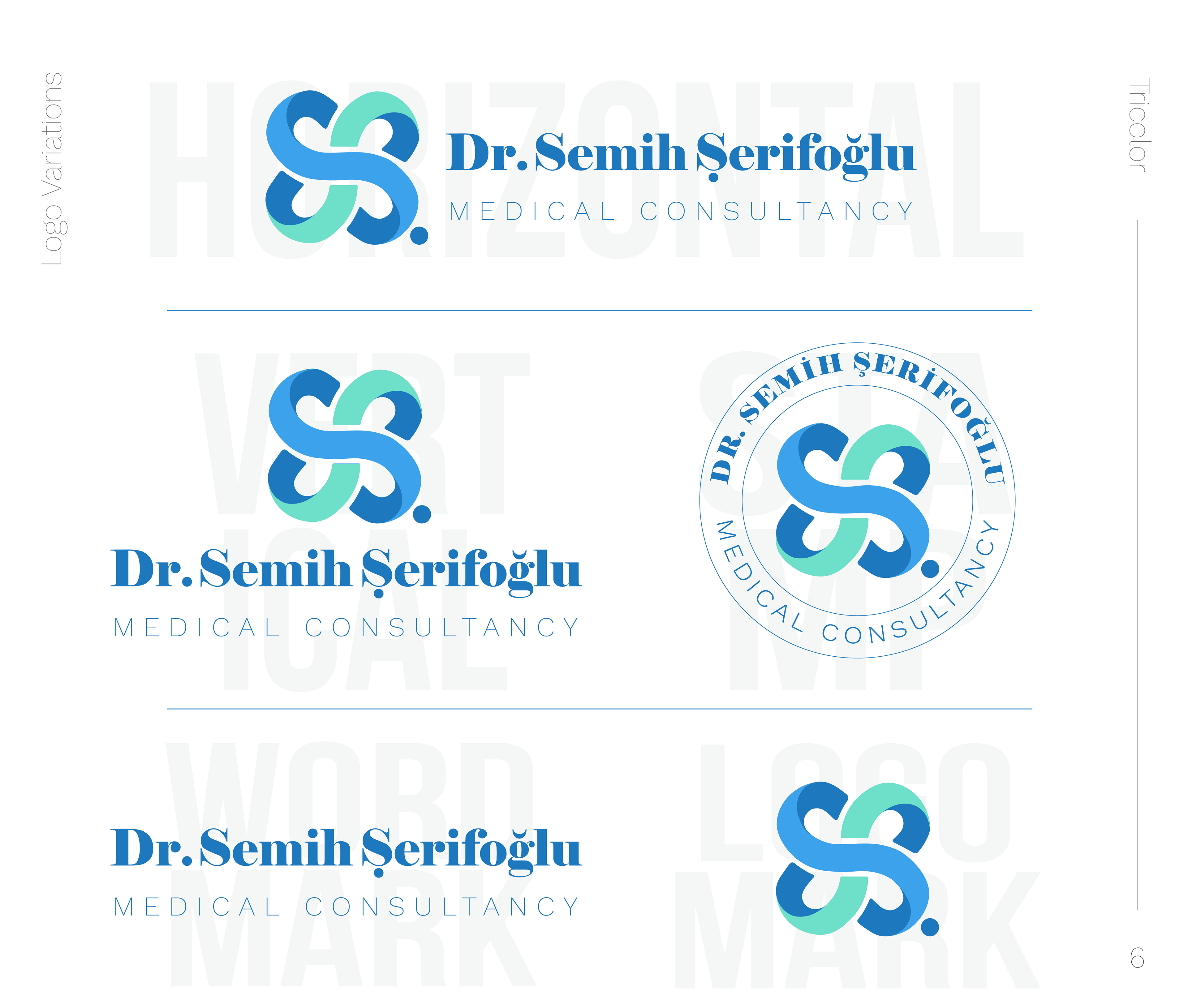
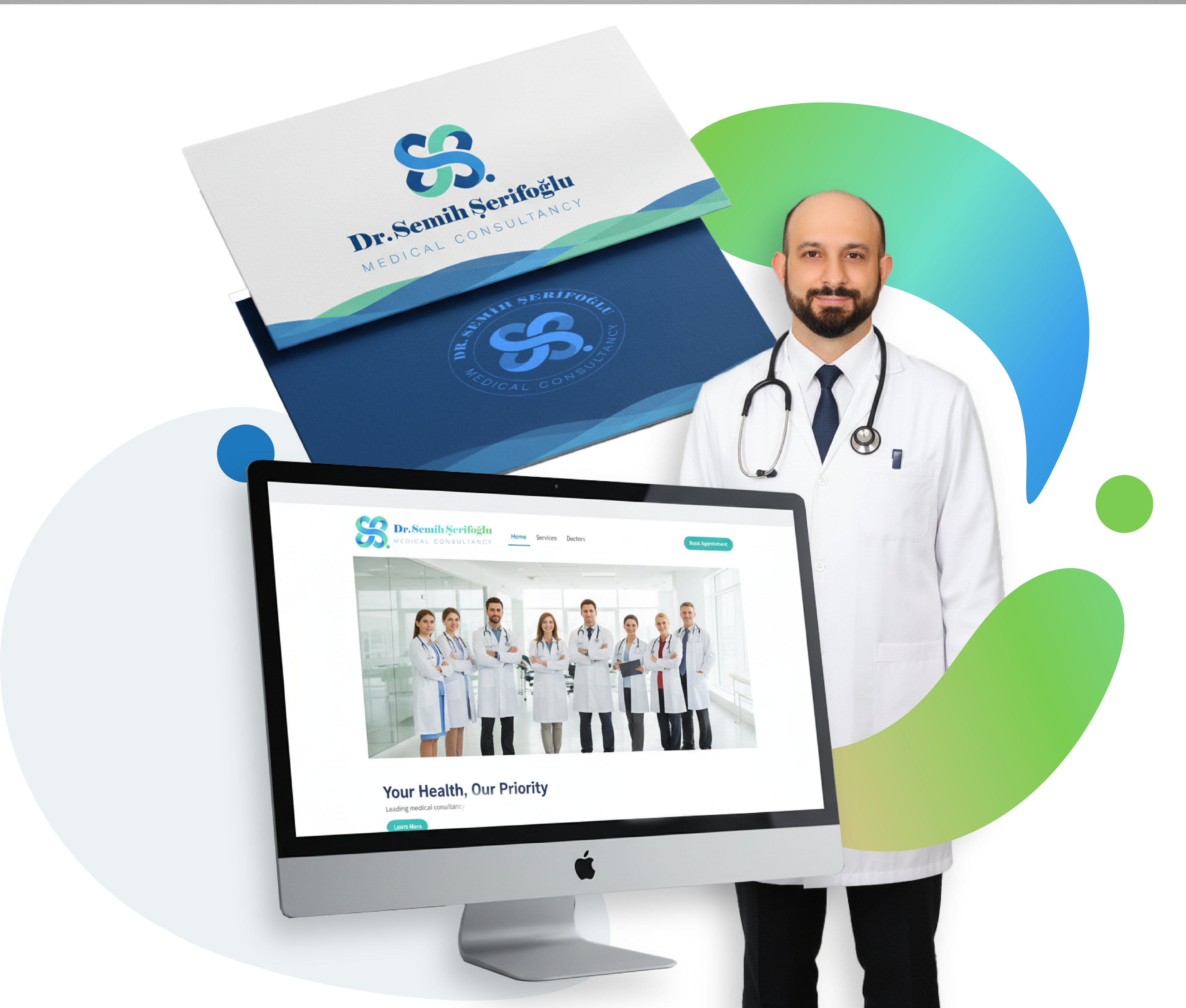
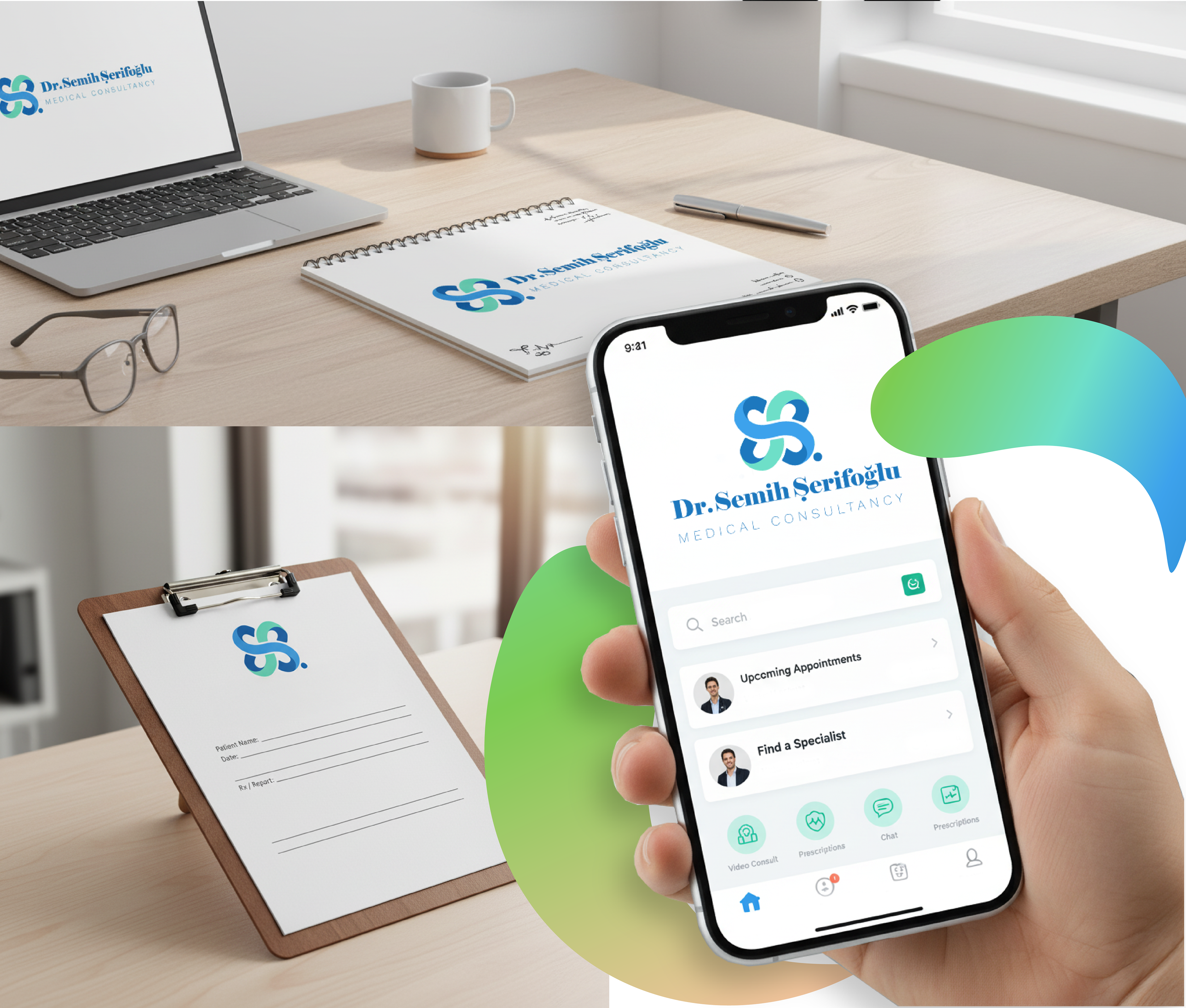
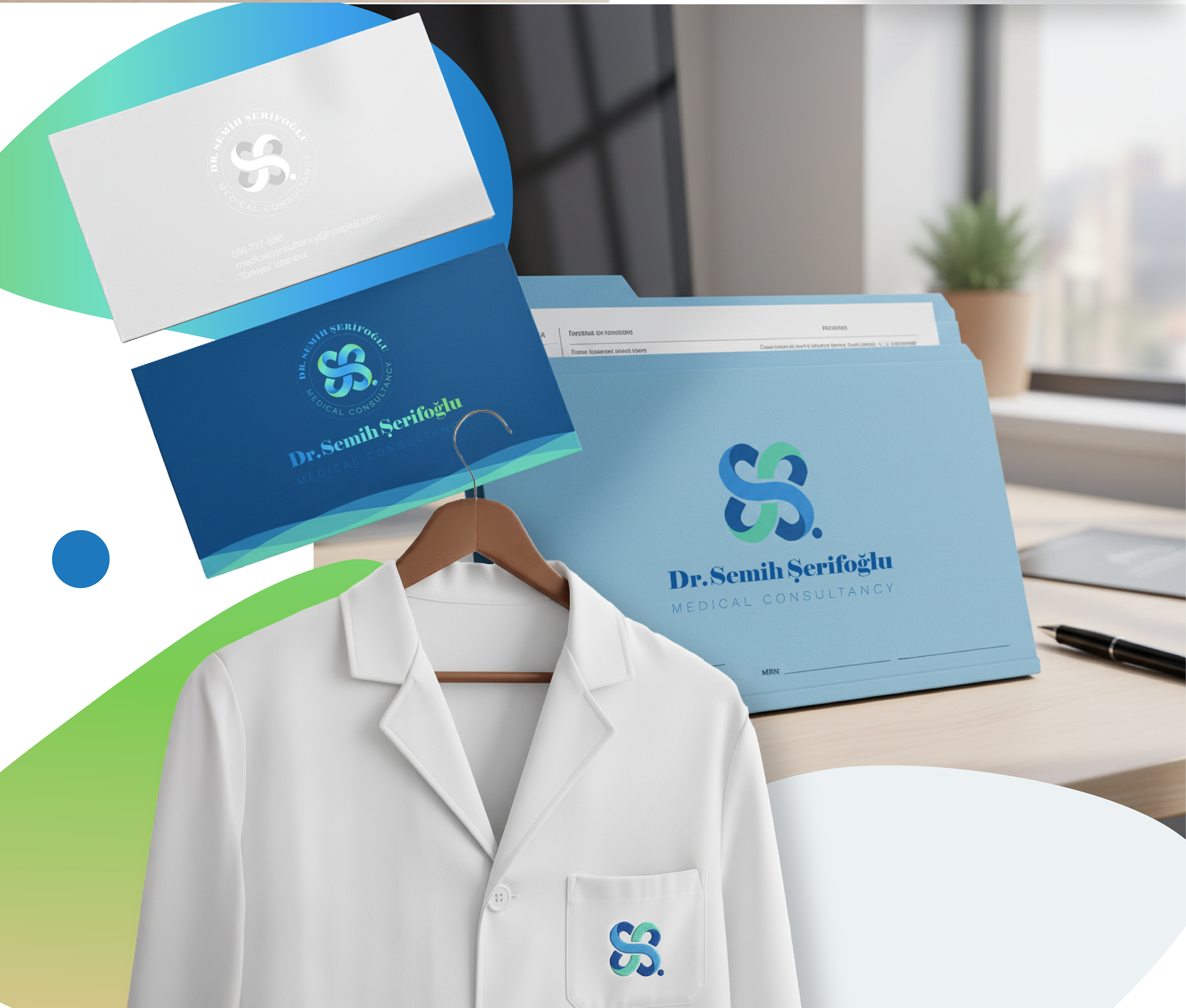
The identity system is designed to instill confidence at every touchpoint. Whether it is the signage on the clinic facade, the embroidery on the doctor’s coat, or the user interface of the mobile appointment app, the brand remains consistent, clean, and professional.