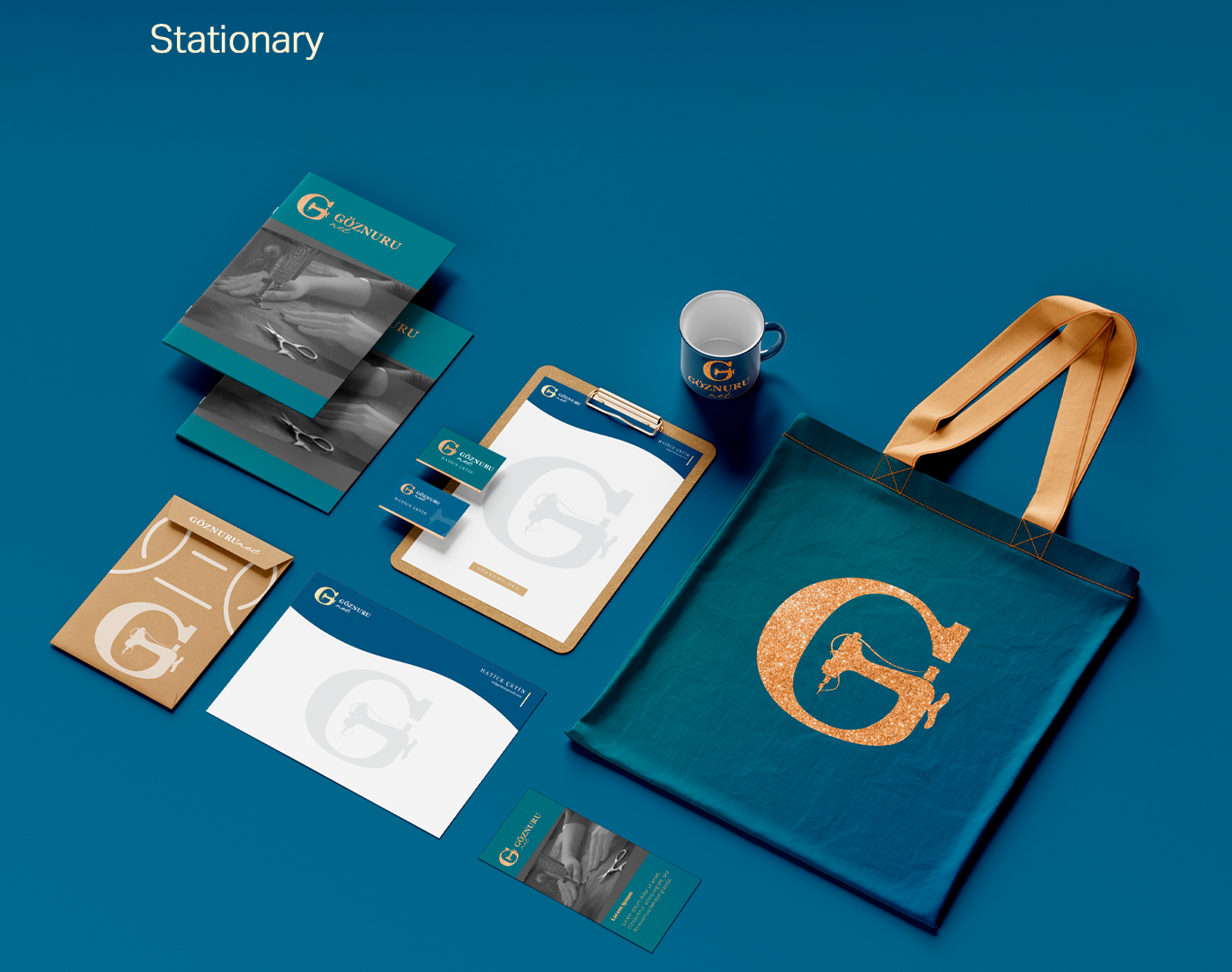
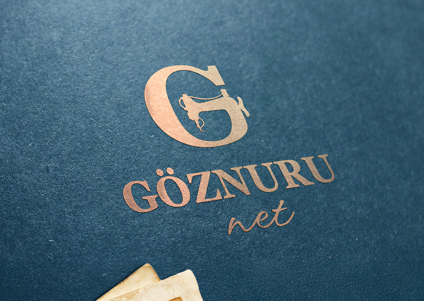
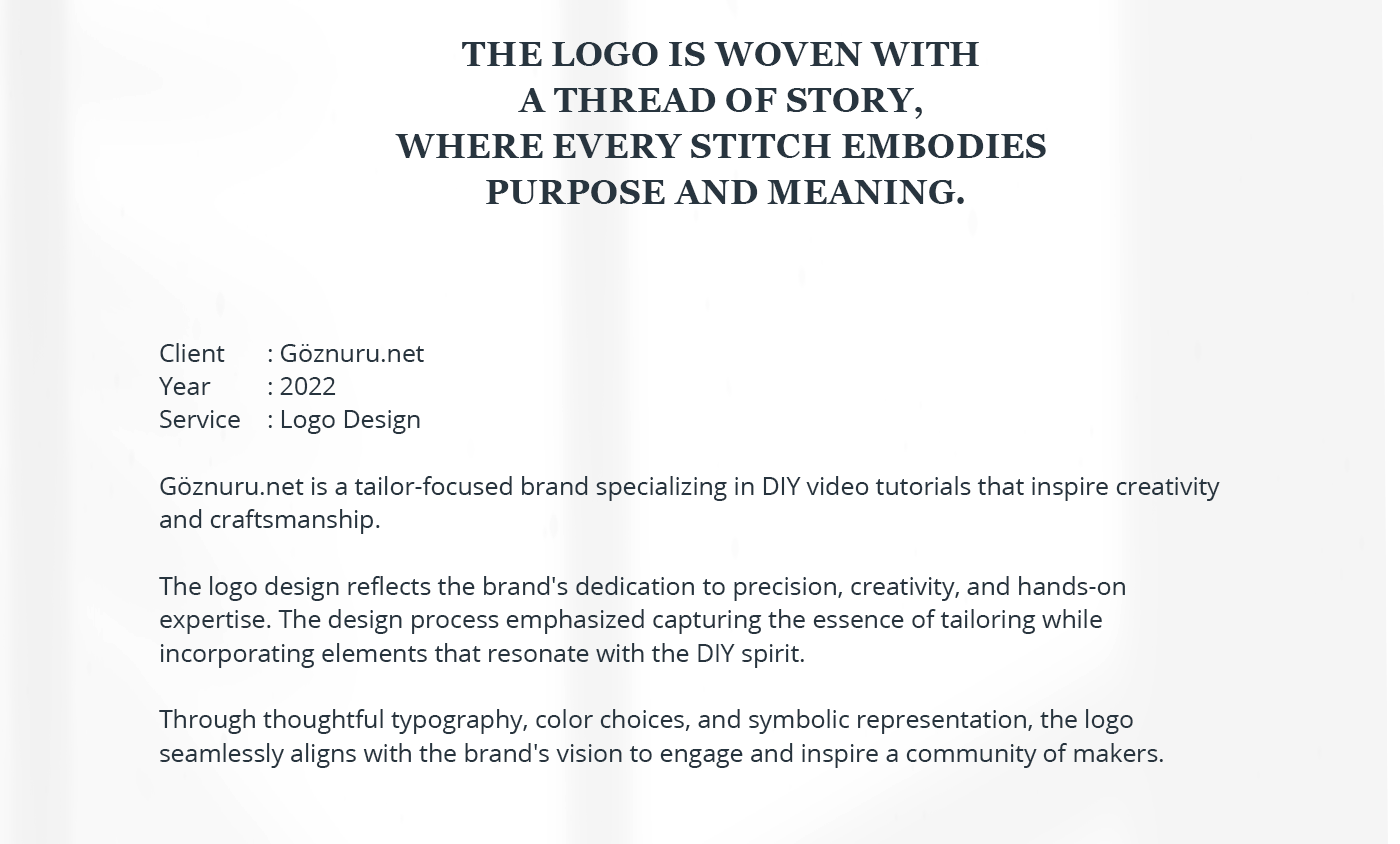
*** "GÖZNURU" is a Turkish term symbolizing the intense labor and strain of the eyes required for intricate handicraft. This branding project embodies the soul of traditional tailoring, merging vintage aesthetics with modern elegance. The visual identity focuses on the art of the stitch, targeting a premium audience who appreciates bespoke fashion and textile mastery.
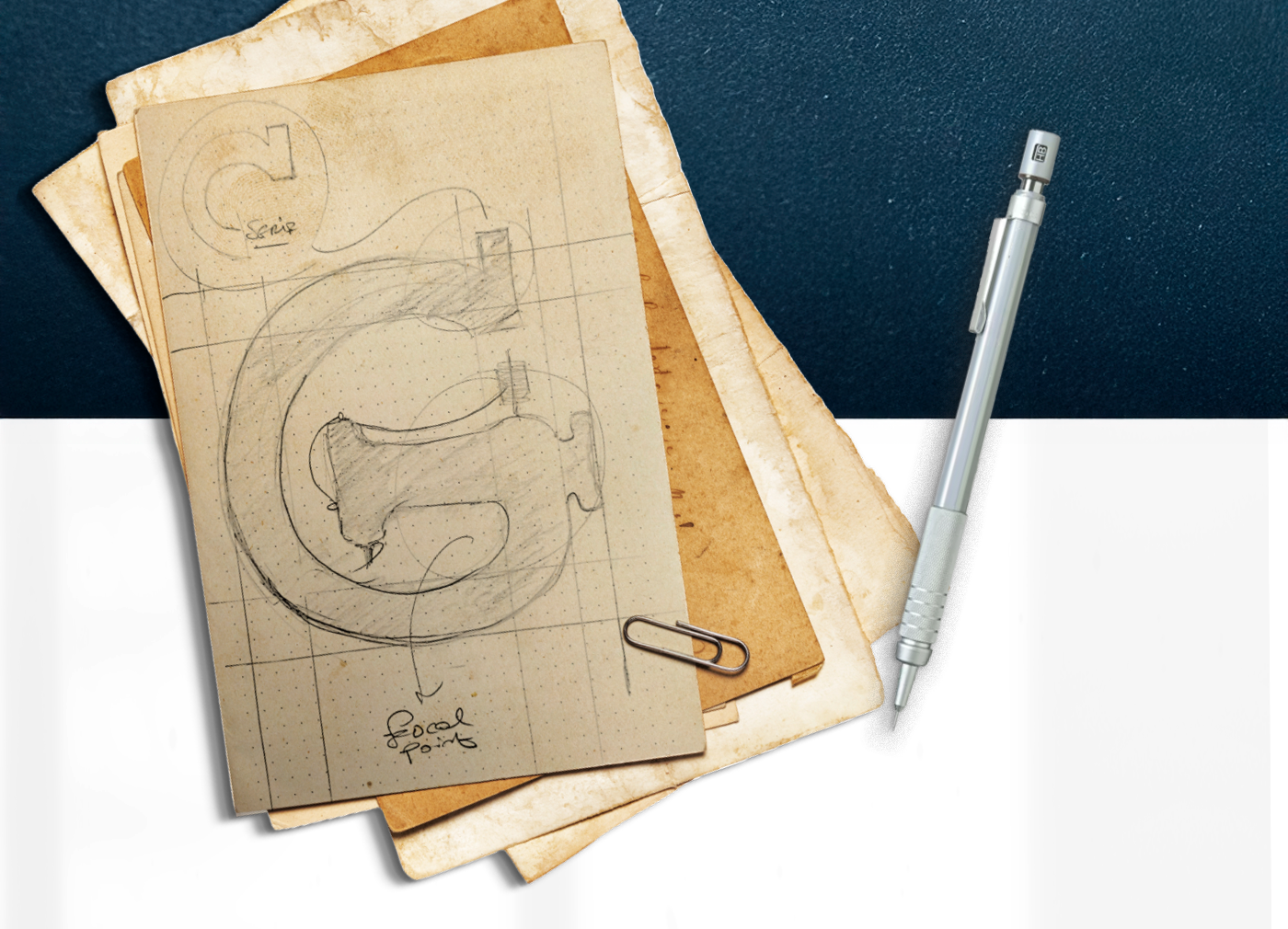
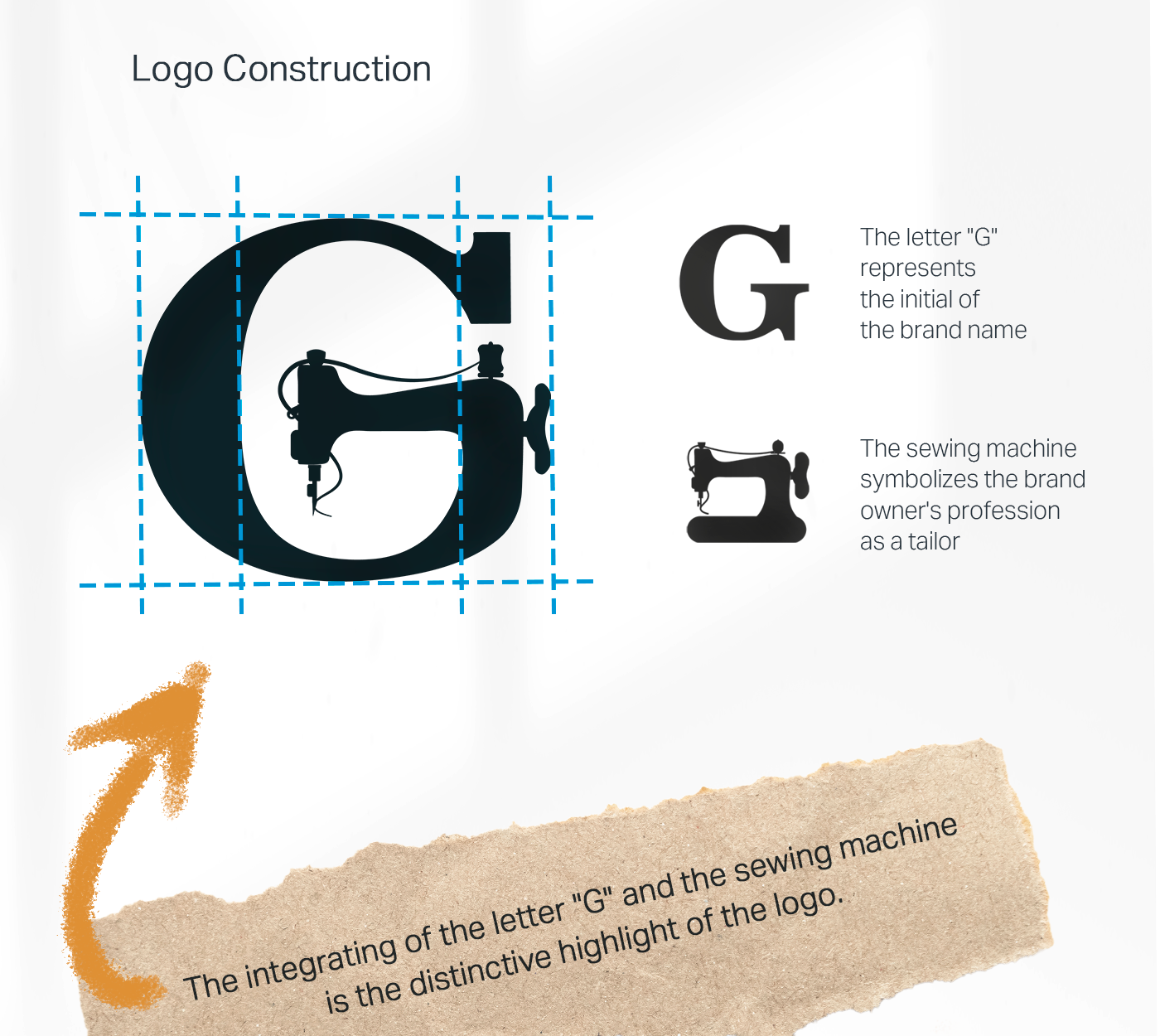
The core of the identity lies in the custom typography. The serif letter "G" serves as a frame, seamlessly integrating a negative-space silhouette of a vintage sewing machine. This duality represents the bridge between the tailor’s name and their tool of trade. By combining a classic serif font with the mechanical icon, the logo communicates stability, history, and precision. It is a tribute to the golden era of fashion design where every stitch was calculated.
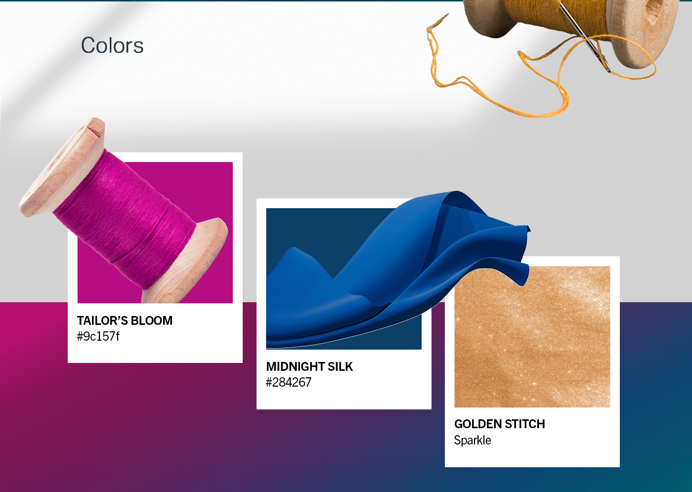
Color & Materiality: The brand palette is anchored in Royal Navy Blue and Antique Gold.
Navy Blue: represents trust, professionalism, and the depth of premium fabrics like velvet and silk.
Gold: symbolizes the high value of the "Göznuru" (hand labor) and adds a touch of luxury to the packaging and stationery.
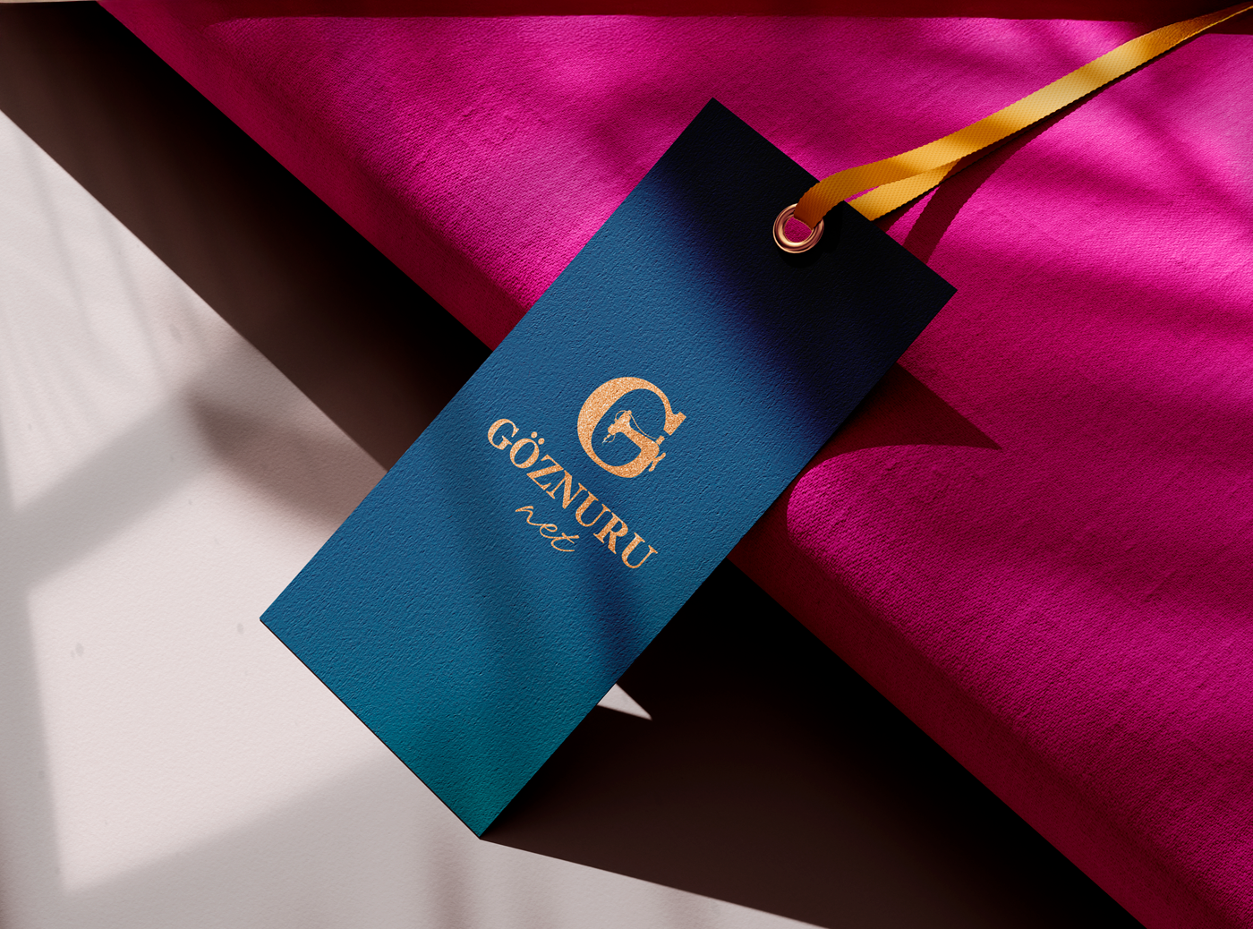
Complementary accents of magenta and beige bring warmth, reminiscent of tailoring chalk, tracing paper, and vibrant threads used in haute couture.
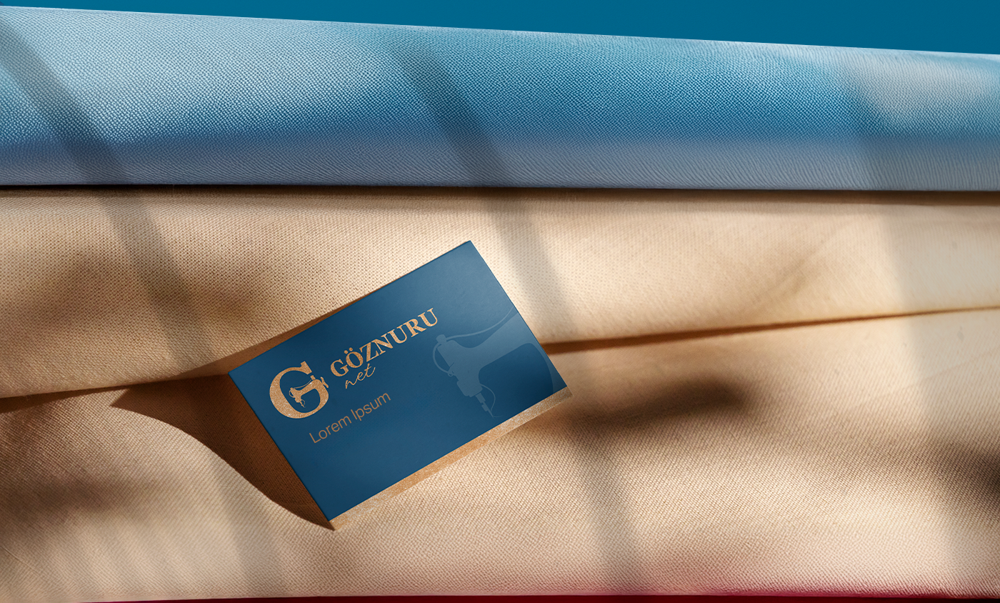
From business cards to clothing tags, the GÖZNURU identity is designed to feel tactile and established.
It is not just a logo; it is a seal of quality for every garment it accompanies.