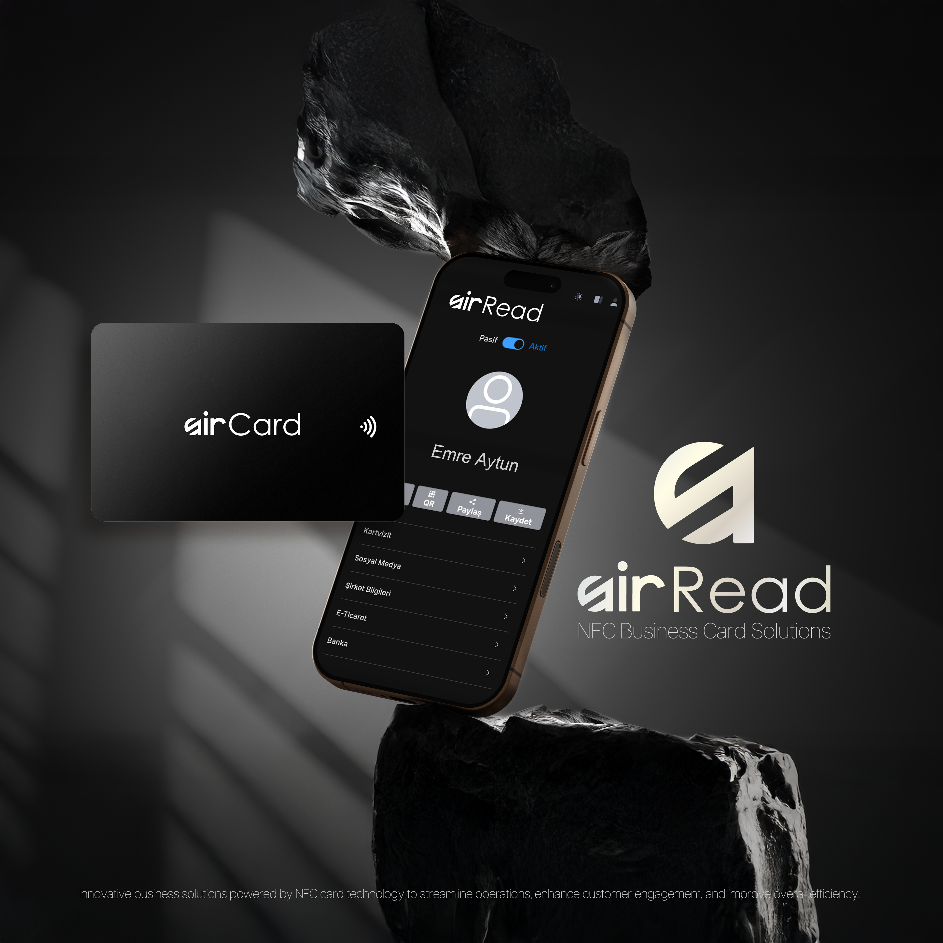
AirRead is a forward-thinking technology brand focused on digitizing the physical world. Whether it is smart receipt management or contactless data reading, the brand identity conveys speed, clarity, and seamless integration. The design language is minimalist and futuristic, targeting a user base that values efficiency and paperless solutions.
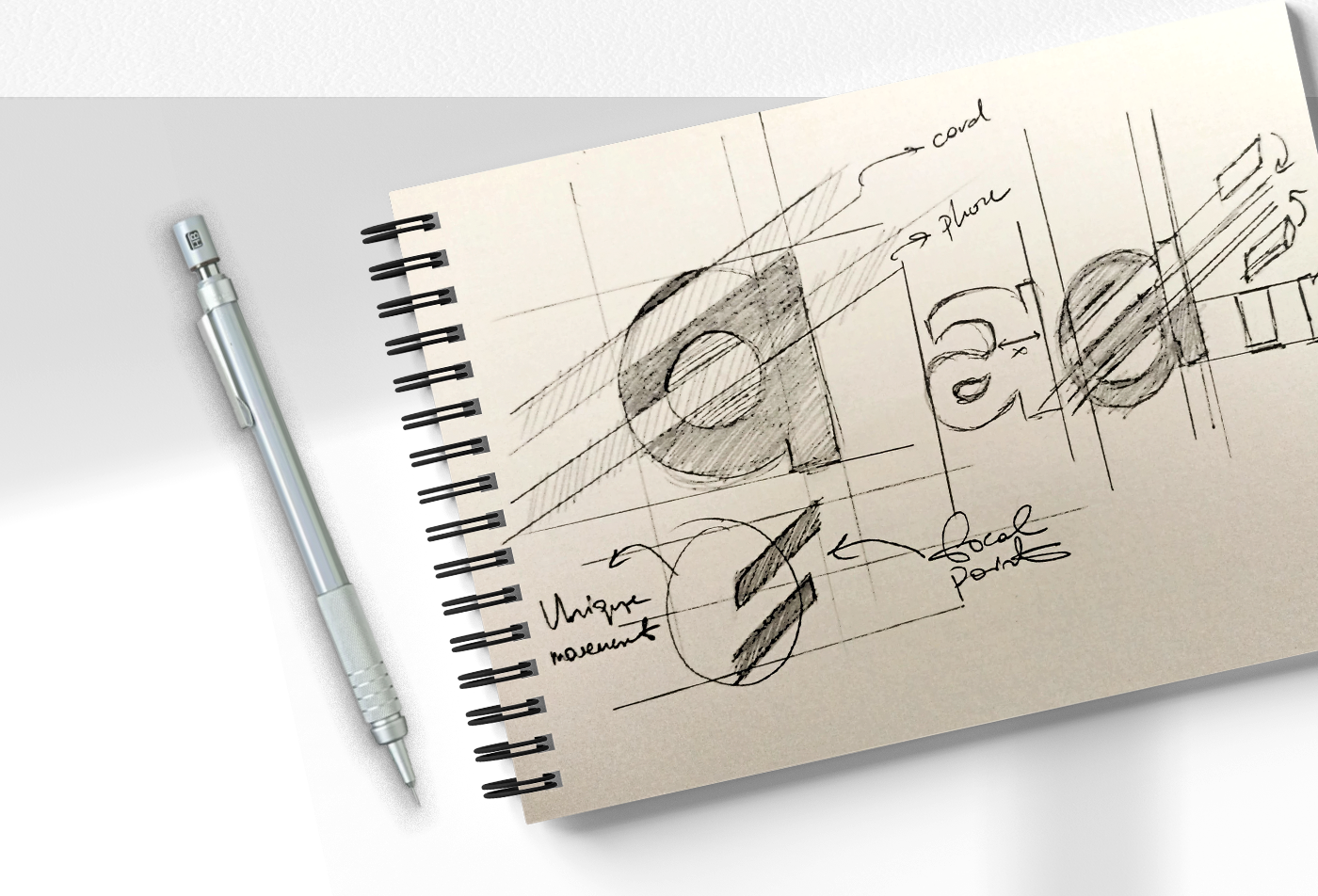
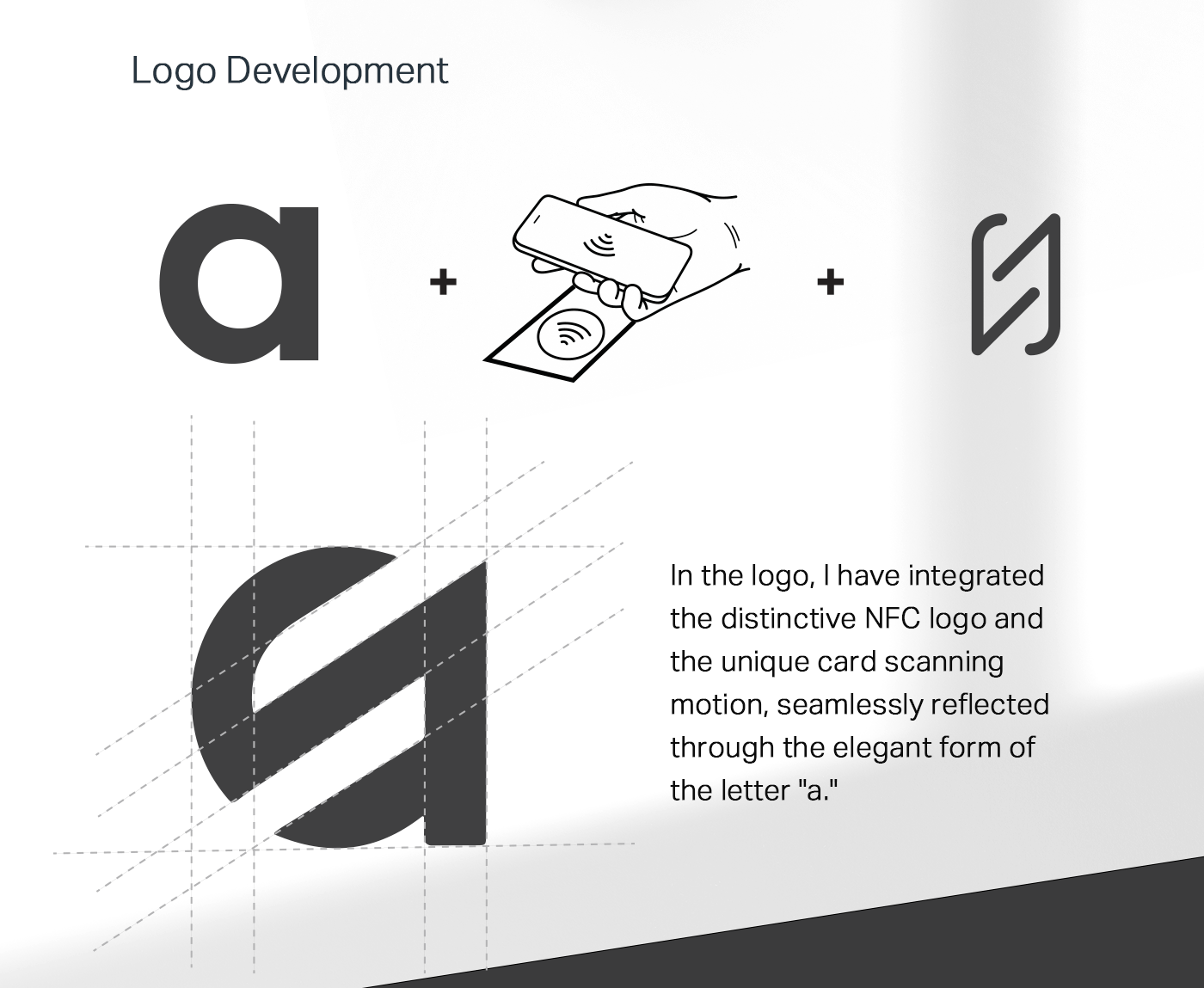
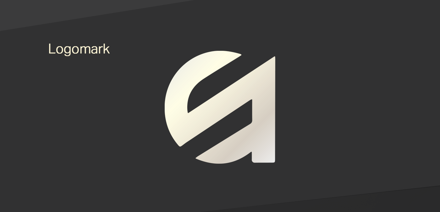
The Logo Architecture: The AirRead symbol is a geometric abstraction that tells a story of transformation.
The Letter 'a': Represents the brand name and "air" (wireless/cloud).
The Card: The icon mimics the silhouette of a NFC card being scanned.
By merging these elements into a continuous, fluid shape, the logo represents the transition from physical card to digital data. The result is a dynamic monogram that works perfectly as an app icon or a corporate watermark.
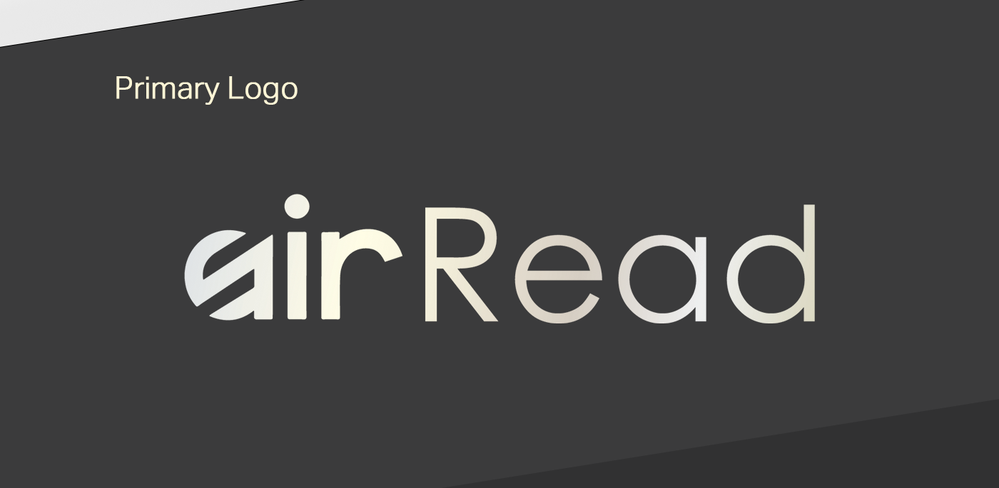
Color Palette
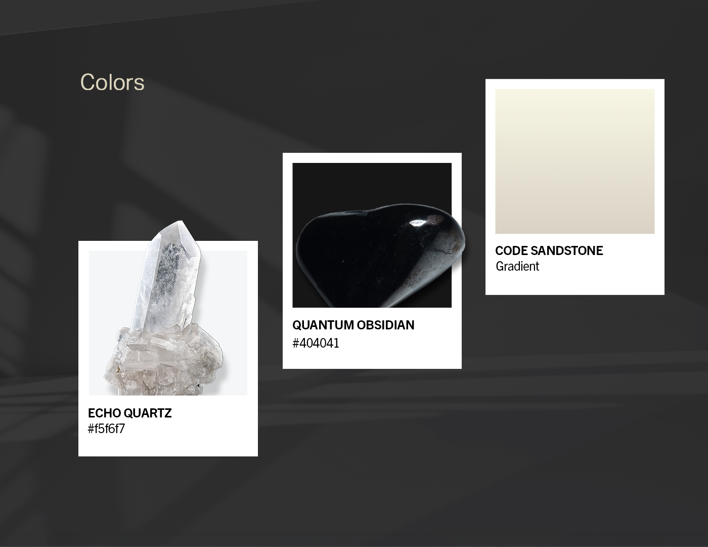
Monochromatic Luxury The visual identity creates a high-contrast aesthetic that feels premium and trustworthy.
Carbon Black & Dark Grey
Evokes authority, modern technology, and the solidity of hardware.
Paper Cream/Off-White
A subtle nod to the texture of physical paper and reading materials, providing a soft contrast to the dark background.
This strict color code ensures high readability and a sleek "Dark Mode" aesthetic popular in modern UI design.
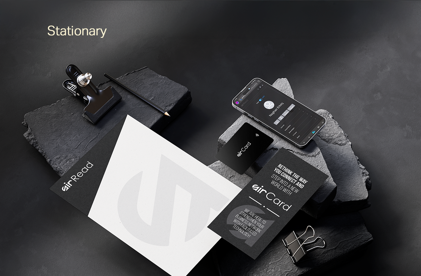
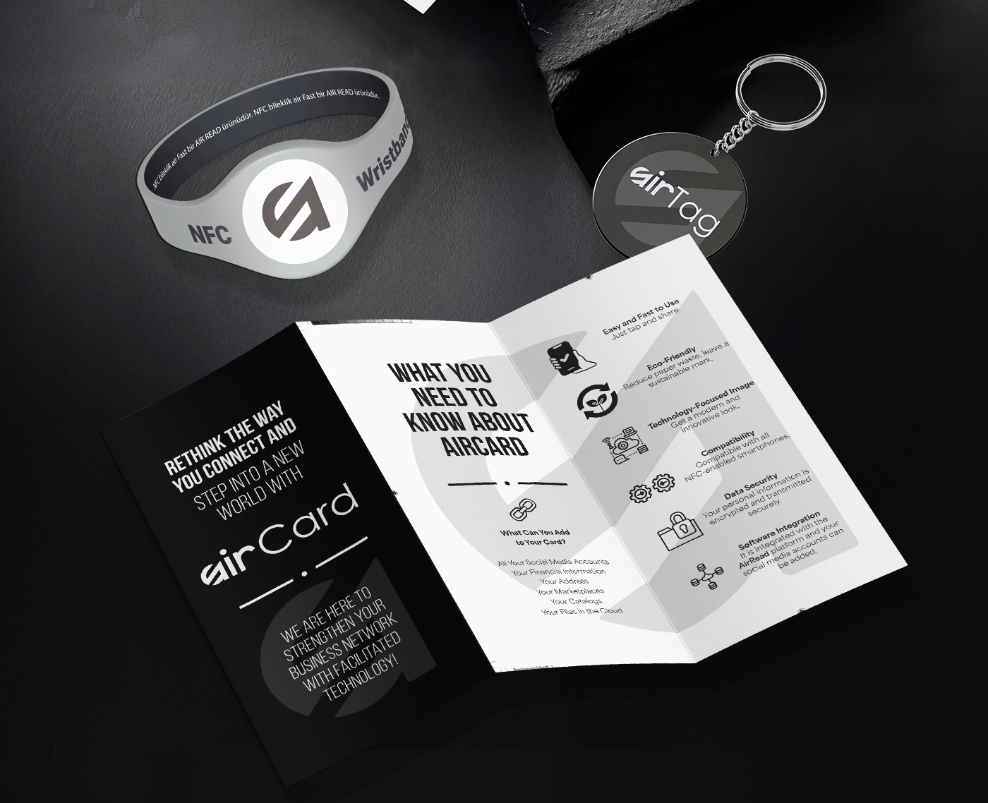
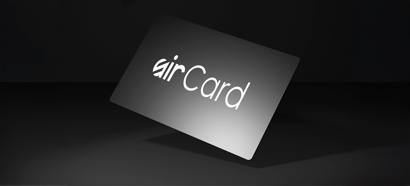
Corporate Identity & Application: The AirRead identity is designed to live beyond the screen. The presentation showcases how the brand extends to physical touchpoints, including the "airCard" (smart business card) and corporate stationery. The bold use of the logo against dark textured backgrounds creates a sophisticated, tactile experience for the user.